Showing posts with label style. Show all posts

Saturday, May 12, 2012

Are overly large frames a style?

Question

I helped my mother hang some photos today and was curious about one of them. She had placed a photo (in this case 5"x7") in a frame that was much larger (8"x10"). In my opinion it looks strange and awkward with so much empty space—which I feel is wasted—but she insists that it is actually a style (which while loathe to accept, I am inclined to believe because she does watch style type shows).

Does anyone know of this style? Is there a term for it?

Asked by Synetech

Answer

That's a perfectly accepted and normal style of mounting a print - known as 'matting' a print. The border around just further draws your eye to the photo.

Answered by rfusca

Wednesday, March 28, 2012

How can I tell when to stop adding an effect?

Question

When I shoot a photo and load it into my image editing software and start playing with curves and sliders, sometimes I go so far. For example I increase the saturation and I keep increasing it till it doesn't look so good cause the photo becomes very saturated and unnatural, but I don't feel that till someone take a look and says that colors are too strong or I go away for sometime and come back to look at the photo and I say to myself what I was doing! It's too way saturated. Same goes with exposure, clarity, sharpness, ....

So when should I stop myself and say that's enough? Should I always review my photos after editing them by a day or two? Sometimes I can do that but sometimes I have to print the photos and I need to get them done. Any techniques that can help in this situation?

Asked by Akram Mellice

Answer

I've found a useful technique is to switch between the original and the edited version. By doing this even minor changes sometimes look drastic, which could work against you sometimes, but it's a perfect representation of just "how far" you've gone with the edits. You can see how true you're staying to the original photograph and how unnatural things start to look even if that is your intention.

Taking time away from the photo as you mentioned is a really great method too, but as you said their isn't always time for it. With the same idea in mind, if you have other photos to edit you should move on to them once you're a point you're happy with on the current picture. Once you've gone through editing all the photos, start at the first and work your way through again. That should give a little reset time on each photo.

What exactly "too far" is, is up to you as the artist. But I mainly use the first technique as a gauge to see just how much editing I've done.

Answered by Vian Esterhuizen

Saturday, March 24, 2012

How do I create a sense of power and splendor in an image?

Question

I'm trying to take pictures currently that convey strong emotional feelings, and I would like to know whether there is any particular color scheme or type of picture that would convey a feeling of splendor.

Asked by J. Walker

Answer

Very context dependant:

  • Monochrome is often used to ennhance such effects.

  • Add high contrast to monochrome.

  • In some context poor focus or purposeful blurring assists. Maybe a funeral procession or drawing you in to be part of what is happening.

  • Dim and dingy and sidelit and available light and high window and flickering candles etc etc etc .... all help IN SOME CONTEXTS. (Not for eg coronation of the Grand High Whatever.

Knowing he more specific context(s) would help.

Note that "string emotional feelings" and "splendour" would not be a marvellously good match to many people. You may need to better convey what you want to achieve.

Answered by Russell McMahon

Sunday, February 19, 2012

What settings do I have to use to take pictures like this one by S Dot B?

Question

I am impressed by this photograph of hip hop artist Kid Ink by S Dot B photography:

http://www.killerhiphop.com/wp-content/uploads/2011/03/Kid-Ink.jpg

Can anybody tell me the settings for my Nikon D90 to take photos in that style?

I can't explain this style exactly... high contrast? It's kinda soft touch? Are there any suggestions for my camera settings? Or is this all just retouched in Photoshop, and if so, how?

Asked by Paparella

Answer

As others have noted, much of what's going on in this image is about light, but folks seem to be really over-thinking it. It's kind of a habit we photographers get into after learning a few tricks and acquiring (or lusting after) a bit of gear.

The main light for this shot is overhead, and the effect on the subject is relatively soft. Now, it could be that there's an enormous softbox or a strip bank on a boom overhead that's high enough, both in height and intensity, to light the subject, the tires, the frame of the parts shelving and the car doors. That light is coming from both behind and in front of the subject, and to both right and left -- you can tell by the highlights on the jacket's sleeve creases and the prominent highlights on the subject's ears and nose, along with the lack of distinct directional shadows, even if you're not looking anywhere else. It's a possibility, sure -- but don't get too hung up on it. It's just as likely that you can get the same kind of effect with just the normal overhead shop lighting, with some of the fixtures turned off for effect.

There is a secondary light source that the photographer definitely added, though. Notice the eyes. Then notice that, just on the subject, there is fairly strong lighting from below everywhere. The hand causes an upward shadow on the face, the bottom of the eyebrows and the lower eyelids are softly highlighted, the forearm, hand and fingers are bright at the bottom. The catchlight in the eyes tells you that it's a large, even, and probably square source directly in front and well below eye level. (The "square" part is a guess, based on a very low-resolution image -- it could be a rounded rectangle, or even a circle, but I'd need to see something with a higher resolution to tell for sure.) And I do mean large -- it's probably something on the order of 40-48 inches. Don't panic: it's more likely to be a reflector than a softbox, and unless you absolutely need to have the same shape of catchlight in the eyes (and you can fake that in Photoshop) it doesn't need to be a square one.

Having at least one good reflector in your kit will make a world of difference to your photography. I rarely go anywhere with a camera without at least my 95cm/37-inch Lastolite Sunlite/Soft Silver reversible (the 120cm/48-inch isn't quite as easy to stuff into a backpack or messenger bag). The "Soft Silver" side is a good compromise between the qualities of silver and white reflectors, and the "Sunlite" side is a little hotter and warms the colour temperature less than a gold (or the usual "zebra") reflector, and I find it faster to use than messing around with the covers on a 5-way. But there are a lot of makes out there that come with much lower price tags than the Lastolites, and any of them is worth having. And there's nothing wrong with a DIY substitute if price is a bigger concern than portability.

There is a bit of work done in post, too. I've noticed that the photographer almost always raises the skin tones of his (often African-American) subjects above the "straight" values. I'm not going to get into any discussion of value attachments to light- and dark-skinned people in that culture (although that might have something to do with it) -- I think it's more about making the tattoos most of his subjects have more prominent, since the tats are very much a part of the subjects' identities. Raising the skin tones then increasing the contrast in the tattooed areas, particularly when the area would normally be in shadow, allows the subjects to "brand" themselves more effectively.

As for the settings, a relatively large aperture (low f-number) will get the subject/background separation right, and use a shutter speed and ISO that will allow you to expose to the right, at least to a degree, so that you have room to work with the skin tones.

Answered by Stan Rogers

Friday, February 10, 2012

When is it more suitable to have a full sensor-camera instead of a crop sensor-one?

Question

I've been reading about this a bit, and I get the sense that full sensor-cameras are best suited for shooting landscapes, whilst crop sensor-cameras are preferable for portraits and close-ups. Please correct me if I'm wrong. What I would also like to know is which type of sensor is best suited to these other styles:

  • Bokeh
  • Action (fast shutter speed)
  • Black & White
  • Macro
  • Low light
  • Time-lapse
Asked by the.midget

Answer

I would not say that crop sensor cameras are preferable for portraits or close up. I would say they are preferable for the budget minded individual, especially those who want longer focal lengths for less of an investment, and those who want a higher FPS camera due to the smaller mirror. Full frame almost always has an advantage in quality and technical photographic matters. Some areas where it falls short of crop sensors are in high FPS shooting, size of the body, price, and one may consider the smaller portion of the lens being used to be an advantage as well.

Specifically on your question of which styles of photography are better suited for which sensor - The previous thread already covered the "action" piece here:

You have more mirror to move on a full frame camera. The larger heavier mirror usually means shooting speed is limited. The mirror on my 5D moves so slowly I can actually see the world slide sideways/up for an instant!

for some uses (sports etc.) the smaller sensor size is helpful for the extra reach and speed it allows.(sic)

It also covers in great detail the bokeh piece. For the remaining styles b&w, macro, low light, and time-lapse - the advantages of the full frame sensor in sharper optics, bigger pixels, a better viewfinder, etc are usually all advantages in these styles. Macro is one area that may warrant a separate discussion - as this might get into some more technical discussion. If macro is your main pursuit, I would open up a new question and ask about full frame vs crop for macro use. Generally though I would still prefer full frame for this style.

Answered by dpollitt

Tuesday, January 10, 2012

How to reproduce Renaissance painting styles in photography?

Question

Rembrandt lighting is a well-known technique to produce Chiaroscuro, presentation of depth using light and shadow areas.

But in addition to Chiaroscuro, there were three other painting modes in the Renaissance - Sfumato, Cangiante and Unione.

Are those styles also applicable in photography, and if yes, how would one reproduce them?

Answer

Purely photographic implementations of cangiante (literally "changing", but figuratively "tone forcing") are actually quite common, using warmer light in the key (main light) and cooler in the fill. Every time you use a gold reflector to light a subject against an inky blue sky at twilight, you are using cangiante. The actual greyscale tonal value difference between highlights and shadows is much smaller than with chiaroscuro; the difference in colour temperature between the two gives the same sort of impression of depth with a much smaller value variation. The Impressionist painting (and photographic) style is similar, playing warm highlights against cool shadows to give the impression of greater tonal variation. This allows images to be relatively high in key while maintaining "body" in the subject shapes.

Sfumato can be approximated with nearly-direct (axial) soft light (either a large softbox or a ringlight), often combined with soft focus or a diffusion/star filter. Getting to the point of actually losing all sharpness of detail would probably be unacceptable for "straight" photography due to the viewer's expectations of the medium, though it might work well in a fantasy fine art mode.

Pulling back from the edge of blurriness and giving some substance to edges without emphasizing them (as one would in chiaroscuro), you arrive at unione. Again, the tonal key tends to be relatively high, or at least the darks are moved up the tone scale somewhat as compared to chiaroscuro. (Originally, that was more of a limitation of the medium than anything else -- it is hard to get real darks in egg tempera or fresco other than black, and easy in oils.) Soft light, not too far away from axial (call forty-five degrees either side of the camera an absolute limit unless the source is large enough to provide substantial wrapping at larger angles) combined with a relatively high degree of fill ought to get you close to the Renaissance ideal. The exact placement and depth of shadow is a matter of personal preference, but if anything falls off to total darkness, or if the shadows are too well defined, you are in chiaroscuro territory.

Tuesday, January 3, 2012

What style of composition for food photography triggers people's appetite?

Question

What kind of style and position triggers more the appetite of people?

What are the best ways to position food and combine with other objects? What kind of objects are better combined with food? Does a shooting angle that resembles the position that someone would have if he was about to eat the food create more appetite?

I'm not talking about lenses, and also not about the styling of food itself.

Answer

This might help 10 tips to make food look tasty

Friday, October 21, 2011

How does one develop good photographic vision and style?

Question

I am a relatively new photographer. I've only owned my Canon Rebel XSi for a year, however I was researching SLR/DSLR camera gear and photographic theory for over a year before I purchased a DSLR. I have extensive theoretical knowledge, and I understand the technical aspects of cameras very well. I think this has lead to some of my troubles with practical application, however. All those technical details seem to get in the way, and I don't have any artistic knowledge to balance things out.

I am primarily interested in landscape, wildlife/bird, macro, and other nature photography. I am wondering how someone in my position can go about learning the artistic aspects of photography. I have several of the most recommended books, like John Shaw's Nature Photography Field Guide and Developing Vision & Style. Shaw's book is great, however primarily film based, and a lot of the book is about film photographic theory and technique (i.e. "pushing" film ISO). The Developing Vision & Style is a phenomenal book that interviews some fantastic artists, but does not really get to the heart of how one really develops vision and style.

Are there any other resources I could use to help me learn more about the artistic aspects of nature photography? Books, web sites? Personal tips are also welcome.

Many thanks for your insight.

Answer

We've moved into (in my opinion) a more philosophical question with art and photography.

To answer this, you need to figure out what is your definition of "good photographic vision?"

How do you measure the artistic value of a photograph? To me, that is a very subjective question; much like judging any type of art is.

I have had the luxury of visiting many of the worlds finest art museums, and not every work of art that is on display had artistic meaning to me. In fact, I now know that I prefer modern art to the the classics.

So to get to your question: Spin it another way: Why do you think your photographs lack in artistic value? Are you judging your own work yourself? We're all probably our own harshest critics.

My definition of art is: any work that evokes an emotional connection. What is your definition?

How does one get better?

Like all artists, you need a mentor. Study the works of photographers whose work you admire. Every great artist spent years studying the works of other great artists.

Like many artists, you may need to leave your home. How many great authors, painters, sculptors, have traveled to find inspiration. Perhaps you need your own "walk about" (yeah I'm a Lost fan :)

Take risks. Since you enjoy nature photography, how about trying a different type of photography, to get you to think outside the parameters of nature. Street Candids, or still-life, macro, sports. A subject you don't have the "technical" mastery of will force your right brain to engage more.

Experiment. If you always shoot nature with tele's, try grabbing a wide-angle and see what you get.

Practice. The idea that creative types just know how to be creative is false. Artists spend so much time honing their skills, and it's the same with photography. The Beatles played shows day in and day out for years to hone their musical skills. Malcolm Gladwell famously wrote about 10,000 hours in Outliers. You said you're "new" to photography, so give it time. If you shot photographs for every hour of every day for the first year you owned your dSLR, you'd still need over 1000 more hours of practice :)

Be a true Renaissance man (or woman). Try other creative outlets. Ansel Adams taught himself piano. Lessons learned in one art form can directly influence the works of others.

Submit your work for critique. Enter photo contests, find a way to get into an art-show, submit your photos online to places that give honest constructive feedback.

Sunday, September 25, 2011

How to get a miniature effect on pictures?

Question

I was browsing Behance and came upon these pictures: http://www.behance.net/gallery/The-Little-Things/402879

I was wondering how he got this miniature style effect? I'm guessing a Gaussian Blur on a strip of the picture in Photoshop...but couldn't get right.

If you know how to make it, please give a stepped explanation. Thanks.

Answer

Basically you want to simulate the shallow depth of field you would get when photographing small objects. This can be done either with lens with tilt function (i.e. special purpose lens called either a tilt-shift or perspective control lens) or by selectively blurring an image in post.

It's not hard to do, but there is something you need to ensure in the original capture, and that is a high vantage point. This is a must, not only are most miniatures shot from above, but you need a steadily progressing depth from top to bottom. This is especially true when using a tilt-shift lens as your only option is a gradually increasing blur, it's possible to fake shallow depth of field from a ground level image but you would have to do an awful lot of very difficult masking if the furthest part of your scene is in the centre of the image, and the result wont look as good anyway.

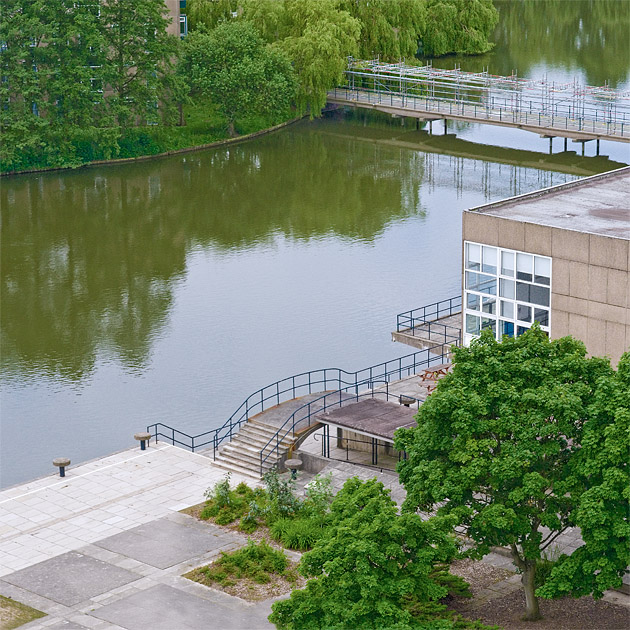
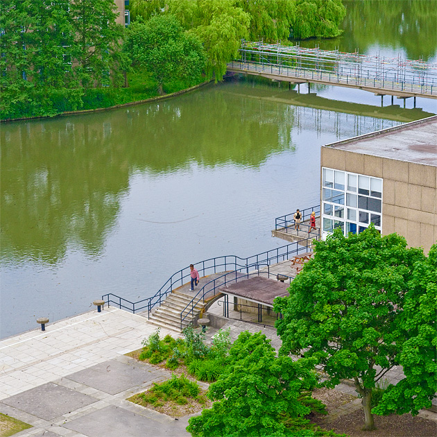
Here's a walkthrough of one of these I produced for the University of York magazine. Here's the original image (actually part of a panorama) shot from the back of a tower crane!

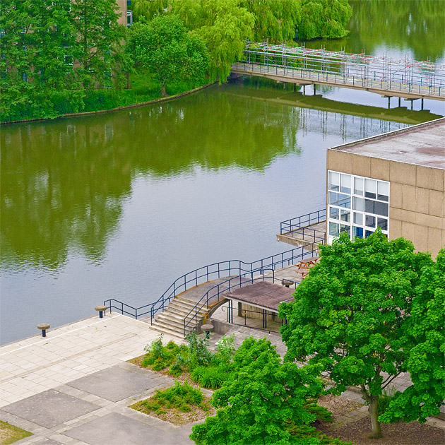
Next I played with the saturation and colours to make it look a bit like a model (if you look at model railways the trees are always an unnatural shade of green!)

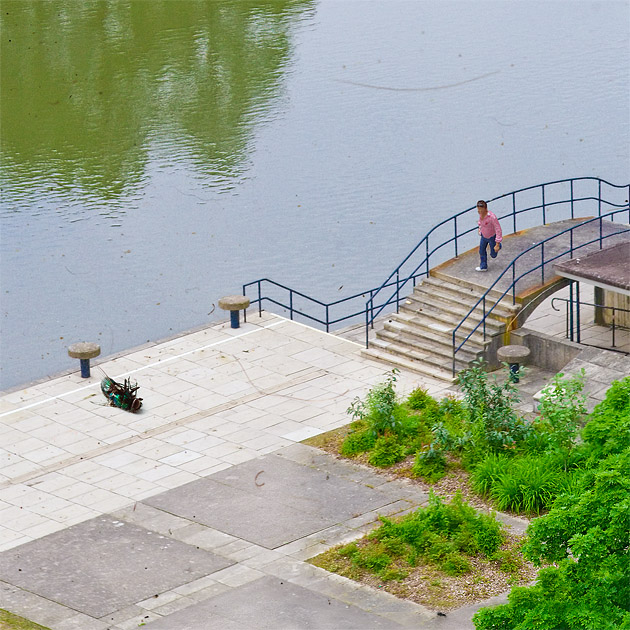
The next few steps are not strictly necessary but I wanted to push the illusion of this being a model as far as I could! I photoshopped in in some dirt, hairs etc. and a few plastic model railway figures (again most of this was inspired by studying images of model railways on flickr):

When doing this sort of thing it's important to add a shadow, even if very diffuse (the whole scene was shot on a cloudy day, so there were no strong shadows) to help ground the figures:

Here's the final prep'ed image (I decided the dead fly was too much!)

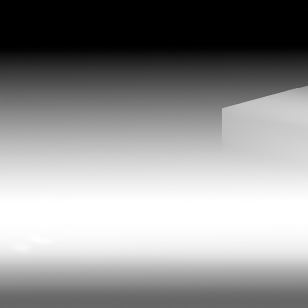
Now to do the actual blurring, now we want to simulate the model going out of focus, which means blurring with an increasing radius from top to bottom. The best way to achieve this is with the photoshop lens blur filter. This takes a "depth map" image, which is a greyscale image where the brightness indicates the radius of the blur at that point.

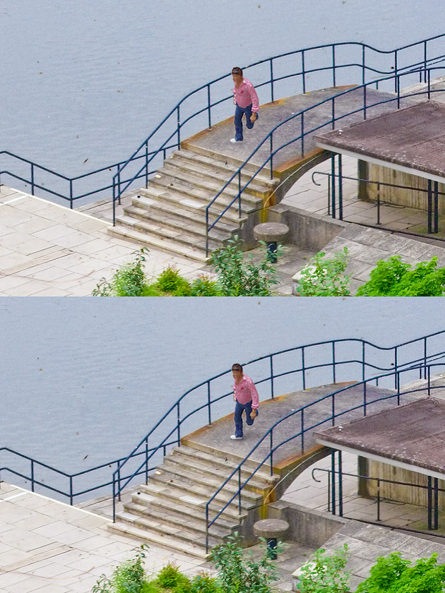
A simple gradient from top to bottom would do, but it gave the effect that the bottom of the building was more blurred than the top, which wouldn't happen in real life as they would both be at the same depth, to attempt to fix this I modified the depth map slightly:

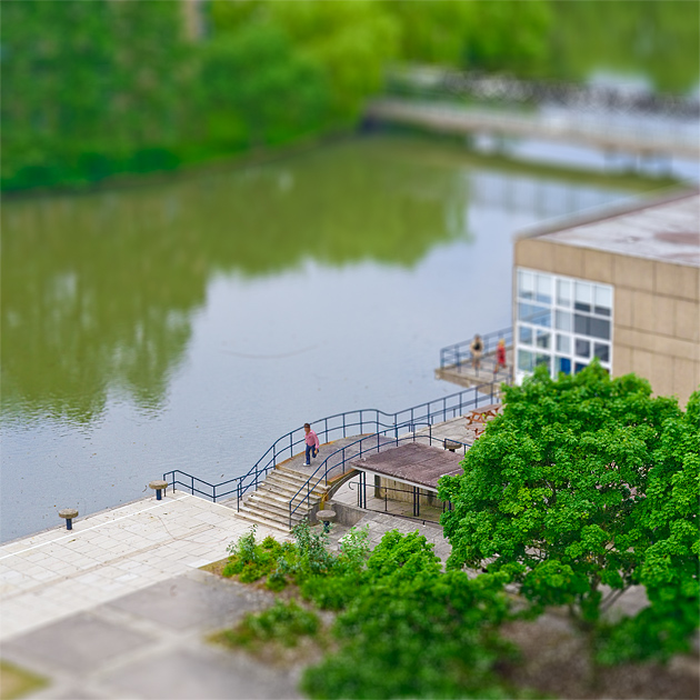
Here's the final image. The effect isn't quite perfect, the trees in the foreground don't look quite right (a lot more fiddling with the depth map would have been required), but it was enough to fool a lot of people.

Tuesday, July 12, 2011

How can I get a 'touristy' photo of myself when travelling alone?

Question

I'll shortly be travelling to new york and staying with a friend (but mostly touring on my own). As much as I enjoy regular photography my only regret from my last holiday is that I didn't have any photos of myself there! So I'd like to take some touristy photos of myself infront of some of the big landmarks.

I've got a crop sensor Canon with my widest lens being 18mm and a point and shoot, neither of which give me a wide enough shot hand held at arms length. I've considered hiring a wider lens, using a wide angle filter, asking others or putting the camera down and using timer but I was wondering if anyone had better solutions?

Answer

I once saw someone taking this kind of picture using a light monopod. He hand-held the monopod and used the camera's self-timer to get the shot. The camera was a Point and Shoot. He sometimes used street objects such as park benches, trash cans, cars, etc, to help reduce camera shake.

The monopod was used just to avoid being so close to the camera, it was still being handheld. I asked him what he was doing and he showed me some of the pictures. He had some practice doing it because he had some real good shots. In most shots he tried to frame himself with elbows out of the picture, thus hiding the monopod!

Hope this helps! ['O]